Here I have done research into poses used in country.I have taken images of Google looking at front covers of existing magazines and other photographs of country singers.Under each photo I will explain what I think of the shot and why I think it would be effective.This post can be used as inspiration when it comes to shooting my own photos.

I Like this photo on a front cover, the neck is made to look long and and the face is illuminated.I like how the hat is clearly in view as it clearly displays that the singer is country.
The hair being wild is a big part of this picture and because she is blonde the whole page is bright.This isn't a type of image that I would use because It would be difficult to get the hair to look as good and I want to have a picture that shows off the costume.
This sideway position allows the face to still be clearly seen as well as it being more interesting than a straight on shot.Also this pose could work well depending on a models hair , if you wanted to have it swept on one shoulder for example.
This long shot very much concentrates on the costume and background as well as the bridle in her hand.I love how the model looks like she is stood naturally and not posing and how she's not looking at the camera.I think for a magazine the model would have to be looking at the camera but like how she's holding the bridle and looks quite western causal.
Both of these images have been posed and thought out but they are both designed to look natural and relaxed.I love the one on the left and think the background completely suites the pose and costume also the colours(browns) really compliment each other.
This pose is different than usual and I think it would make a page look more interesting.Obviously with a position like this its obvious that the model is posing and so it wouldn't be any good if you were trying to create that natural look.The hair can be manipulated to work with this pose as it has been done here.
This pose could be associated with more or less any genre of music.Its done to try and show off the models body and give them the sex appeal.A pose like this wouldn't be suitable for my magazine because I want a more natural looking pose.
This is a very natural pose.I like how the hat is clearly visible but isn't covering her face at all.This type of shot would be good for my magazine as the hair , makeup and costume could still be seen as well as the hat.
This pose is fairly plain however the lighting highlights the face and hair making it look like a very posed shot.I think for my magazine I would like to have a background which would add interest but would also help to display the genre of the magazine more clearly.
This shot and pose is all about the hair really as you cans see the entire face clearly and barley any of the background.In order to create a picture like this it would require a lot of hair styling and make up as well as the correct lighting.I think it looks too posed for what I'm looking for and I also want to be able to see some of the costume and background.
I absolutely love this pose .Although it is very posed the horse is bright and alert and the pair look great.If weather conditions allow and the local pony is available it would be great to try out some shots with her even though it wouldn't look as grand as this horse because its only small.Using an animal always makes a shot more exciting and this photo was taken just at the right time when the wind was blowing to get the hair and mane in action.
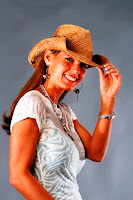
This pose is what I consider to be quite a typical pose for a cowboy/girl.The tilting of the hat (or just hand at hat)The smile looks nice and natural and her position looks relaxed and not stiff.I think this holding of the hat pose would look good straight on as well as side on too.


No comments:
Post a Comment