Wednesday, 26 September 2012

Research and Planning -Different camera shots


Here is my Shot type research some of the sketches haven't scanned in very clearly so I am going to briefly explain what i round doing my research.

The first shot type looked at is a POV (point of view) shot this is where the audience sees what the character would see , my example is riding a horse you would see the horses neck and in front of you.This is a good shot type to use if you want the audience to feel like they are in the scene.It is a popular shot type in horror films.

Long shot-This gives a wide view and if used on a character would incorporate the whole person.It can also be used for looking into the distance.My example is looking along a beach into the distance.

Two shot -Where two people are in the shot this can be a conversation or a romantic scene displaying the relationship between the two characters.Good if you want to show eye contact between the two characters for example.My example is two people looking at one another.

Master shot -This is where everything on scene is shown , usually done by the camera zooming out fro one character too the whole room for example .It can be used to take the focus off one person onto everyone.My example is our classroom where everyone can be seen.

Establishing shot-This is the shot that in my opinion 'sets the scene' as it is often at the beginning of a scene for example if you were filming in New York you may have the first shot in the scene of the New York skyline .My example is the golden gate bridge.

Aerial shot-This shot is a birds eye view.Could be used to show the size of something for example the amount of people.My example is looking down onto characters.

Close up-This is a close up shot of the characters face , used to show expressions and eye movement.There is such a shot as the extreme close up where the camera might just look at the eye or mouth for example.My example is just of a face.

Over the shoulder shot- this is where the camera is positioned just behind the character often just capturing there shoulder in the corner.This type of shot is usually used to capture action as if you were there watching it with the character.My example is an explosion happening.

Wide shot-This shot is usually used to look at scenes that are wide .My example is a country side but other examples are mountains or forests.

Mid shot -This is a shot of a character that includes the shoulder upwards.This is used so that clothing can still be seen as well as facial expressions this is not as intense as a close up.My example is a character chest upwards.

Knowing the different shot types will allow me to choose the right type when making my magazine.Shot types are very important as they change the focus in each image.

Research and Planning -Photos for college magazine

Here are the photographs that i took in preparation to make my college magazine .Some i used and some i didn't but i will explain why below.As we were given plenty of time to go around the college to find different scenes and pupils to photograph it gave us a good chance to have a go at working the cameras and becoming accustom to them and there features.


I like this photo , it would have been a good image for a front cover if i hadn't had a specific photo type.I like how there is an angle to the image but it would have been a better picture if i had been able to take it when there were no cars in the car park.

This is the photo of Costa that i used , it is a nice clear photograph and i think it looked great on the college magazine contents page.


Here is one of the notice boards in the college , i decided it would make a good picture 

Here is a college student that I asked to take a photograph of.This isn't a bad picture when cropped to make it a medium close up however he didn't really look happy so I decided not to use this photo.

Here is the same student on a second picture and again I didn't think he was smiling enough for a front cover of a magazine .

I tried to take a picture of the side of the college minibus as it drove past but I had a pause with the camera and ended up only capturing the back of the minibus.

This is the front of  the college , unfortunately due to the layout of the college I couldn't go any further back to get the whole college in the photograph.

I think this is a good picture I could have cut the background out and used it on the contents page or front cover .

Here is another notice board in the college and I choose to use this image because I ties in with one of the magazine articles. 

This is an image that I wanted to try I don't think it works for the front cover or contents page although it is a nice clear image.

Here is the college receptionist , this image is blurred because i moved my hand before it was captured.

Here is a photo of the cakes at Costa , I think it is a good picture but I decided not to use it due to using the others I had taken.


Here is another student that I asked to take a picture of , unfortunately she was quite shy and wouldn't stay still for me to capture the image.As you can see she wasn't looking at the camera on this one.


This photo is better but not good enough to be used.


I like this photo its bright and sharp.


I thought this photo would be a good action shot for on the contents page, its got good light time and is nice and clear.


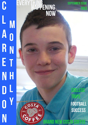
This is the image that I used on the front cover of my college magazine .The posture of his body dose not matter because I was asked to use a medium close up so I can trim it down.I like the smile and I think the blue of his shirt is nice and vibrant for a front cover.


This was a photo that i took thinking it would be good to use on the contents page.

Friday, 21 September 2012

Research and Planning -Finished college magazine and Evaluation


College magazine evaluation 
I think the overall look of both the cover and contents page look good .I think that the sizes of the font work well there not too big and overpowering but they are all easy to read and therefore not too small.The cover has followed the three colour rule (white blue and green).Due to having used the same font and colour scheme it is apparent that the cover page and contents page belong to the same magazine in my opinion.I think the 'Clarendon monthly ' shadowed looks good on the contents page.The photographs taken were all good and appropriate in my opinion , the brief stated that I needed to use a medium close up shot on the cover which I have done.I like the picture of the student that I used on the cover its a nice smile and he looks relaxed and happy to be at college.I think the pictures used on the contents page are a good variety there are some photographs of professionally made signs and some more fun ones like the students playing pool.Luckily in the process of making my college magazine i took more than enough pictures to be able to pick ones that were well taken and were not blurry for example.The amount of stories used on the front page is just right I think, In my opinion with more than three stories you would loose the students(target audience) attention too fast.There are plenty on the contents page and I think the volume of stories helps to bring the magazine to life so to speak .I think that my magazine would appeal to students looking for a way to catch up on the latest college news. If I had to pick anything to change on my magazine if I were to do it again it would be the colour scheme ,I do think it works together but I think it would appeal slightly more to the male market . Colours are definitely something i am going to consider very carefully when planning my music magazine.Also the contents page would look more professional if it were to have a Regular contents and Featured contents section.

Tuesday, 18 September 2012

Research and Planning -Audience interview

After listening to what the audience had to say about my magazine draft I  now know how I can change my college magazine to improve it.Here is some of the feedback that I have got from the interviews;
-Clarendon monthly is a good name for a magazine because it clearly informs the audience what the magazine is about.
-I asked how much the students would be willing to pay for the college magazine, I found that they would like it to be free or cheap (around 50p)
-to help me to complete the contents page I asked the students what information they would like to see inside the college magazine .Every student that i asked said they want the magazine to inform them of what is going on in the college and anything that is new for students(exam dates for example).
-I asked the students what they thought of the colour scheme i have chosen (white , grey  and green ), the feedback I received was that the green could be 'dulled down a bit' and then got told that the colours could be brighter by another student I interviewed.I was told that the colours were interesting and off camera got told that it is definitely a magazine that you would easily recognize on a shelf with competitors. 
-The last question I asked the students was what they thought of the tagline on the magazine , I got told it was good and will draw the reader in .
Overall i was happy with the feedback i got from doing the audience interviews and from this I will edit my first draft of my magazine slightly before publishing my final design.

Research and Planning- Semiotics font activity

I was asked to create different masthead deigns to check that i understood semiotics in preparation for making my magazine.I was asked to create a Popcorn masthead , Death metal and Popworld.I decided to use  pink for the popcorn to keep it bright and i used a picture of popcorn to replace O's .The death metal is dark and scary to represent the genre of music. Popworld is bright and funky.

Friday, 14 September 2012

Research and Planning -College magazine

In order to improve my final college magazine I am going to ask three students to answer five questions after seeing my magazine draft.Using their responses to the questions will give me a good idea of what i can do to improve and change the magazine to make it appeal more to students(target market).

The questions i am going to ask are;
1)Do you think the front cover looks appropriate for a college magazine and why?

2)How much would you like to pay for a college magazine ?

3)What information would you like to see in a college magazine ?

4)Do you like the 'Everything happening now '

5)Do you think the three colours i have chosen work well on my magazine ?If not please state why and possible alternatives.

Research and Planning -College magazine draft


Wednesday, 12 September 2012

Research and Planning -Medium close-up examples


 Here is my research into what medium close-ups look like.Medium close-ups include the head and shoulders .They are used to show expressions but to be less intense than close up.

Tuesday, 11 September 2012

Research and Planning -College magazine analysis

Here is a college magazine I found on the internet.I think this magazine looks very educational and professional.The masthead colour matches the colour scheme of the from cover.The fonts used are quite formal giving me a grand impression of the college.There is an issue number and date under the mast head making it clear and easy for a customer picking the magazine up to know what month it was published.The main picture is of the college its self and is quite scenic and beautiful.The picture used has in my opinion has been chosen to make it look like a peaceful place that is well maintained where students would be able to learn.I would say that the photograph has been edited to make the colours have a brown tint or may have been taken at dusk.The cover line has been used to hint to  the reader of what the magazine contains and has been specifically placed so that it wont get in the way of the main image but is still easy to read .The use of the word 'grand' matches the main image and impression the magazine is trying to portray.The target audience would be college students of around 16-19 in my opinion.

Research and Planning -Indesign tutorial

Here is a film review i have made using the Indesign program. I made this using guides to create the columns .I added the  text and picture which  got from the internet and have started to get used to how to use the program. I changed the title and added a stroke to the text.I used the rectangle tool to add a background colour.  The finished product looks good i think but i would have liked the background to be a paler to make the black text easier to read. A lot of the tool are the same as in Photoshop so the program should be fairly easy to use in the future.

Friday, 7 September 2012

Research and Planning -Photoshop challange

This was a Photoshop challenge we were asked to do.I was asked to open up and A4 document , write AS Media in a certain size an font.I was asked to change the colour of the text and have it in the middle of the page.The background colour had been changed and the text.I got asked to put a picture of a person onto it. I choose to use Robert Patterson an actor. I have changed his hair colour and added a border to the picture.To make my border I added a plain border to my image and the used the paint brush to make it interesting.I like the overall look the blue and red both stand out nicely and the border reminds me of blood ( relating to the charter Robert plays). Looking at this i would like to work on changing hair colour in photos.

Research and Planning -Skin tutorial

Here s the original photograph that I used , As you can see the girl has a few spots and facial marks.I started by using the spot healer to even out her skin .I  then changed the coulour of her hair using the brush tool at a high opacity to make it pink and to allow her hair lines to be seen through .I have added a lip colour , eyelashes and eye shadow.I think that the overall image now looks better but I need to work on using the spot healer to make her skin look more natural.
Finished image


Wednesday, 5 September 2012

Research and Planning -Film poster

I choose to put Meryl Streep into my film poster, this is the original image i used .
This is the Zombieland film poster that i decided to use .
This is a picture of Meryl when I had removed her hair and she is ready to get out onto the poster.

This is my finished film poster , I am very happy with it and think Meryl looks great in the poster.All I had to do was adjust the size of her head and do a little bit of blurring to make her head look smooth on the image.The colors already looked great and I didn't have to alter them.

Research and Planning - Photoshop tutorial

Here is a CD cover I have made. In the past I have used Photoshop but only at a quite basic level.To create this image I began with three images, one of a CD disk with a piano pattern on it , an image of musical notes that I have used on the background and an image of a horn.I began by taking the the CD image and cutting it out and moving it onto the notes background .I tried out a couple of different filters until I was happy with the style.Then I removed the background on the horn and dragged that image onto my CD cover.The original picture of the horn was quite a bland colour so I altered the colour to make it look nice , bright and shiny.To finish off my CD cover I then added my name to make it personal.I like how my CD cover has turned out and the gold colour of the text looks good with the gold of the horn.