Here are the photographs that i took in preparation to make my college magazine .Some i used and some i didn't but i will explain why below.As we were given plenty of time to go around the college to find different scenes and pupils to photograph it gave us a good chance to have a go at working the cameras and becoming accustom to them and there features.
I like this photo , it would have been a good image for a front cover if i hadn't had a specific photo type.I like how there is an angle to the image but it would have been a better picture if i had been able to take it when there were no cars in the car park.
This is the photo of Costa that i used , it is a nice clear photograph and i think it looked great on the college magazine contents page.
Here is one of the notice boards in the college , i decided it would make a good picture
Here is a college student that I asked to take a photograph of.This isn't a bad picture when cropped to make it a medium close up however he didn't really look happy so I decided not to use this photo.
Here is the same student on a second picture and again I didn't think he was smiling enough for a front cover of a magazine .
I tried to take a picture of the side of the college minibus as it drove past but I had a pause with the camera and ended up only capturing the back of the minibus.
This is the front of the college , unfortunately due to the layout of the college I couldn't go any further back to get the whole college in the photograph.
I think this is a good picture I could have cut the background out and used it on the contents page or front cover .
Here is another notice board in the college and I choose to use this image because I ties in with one of the magazine articles.
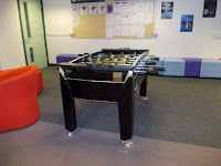
This is an image that I wanted to try I don't think it works for the front cover or contents page although it is a nice clear image.
Here is the college receptionist , this image is blurred because i moved my hand before it was captured.
Here is a photo of the cakes at Costa , I think it is a good picture but I decided not to use it due to using the others I had taken.
Here is another student that I asked to take a picture of , unfortunately she was quite shy and wouldn't stay still for me to capture the image.As you can see she wasn't looking at the camera on this one.
I like this photo its bright and sharp.
I thought this photo would be a good action shot for on the contents page, its got good light time and is nice and clear.
This is the image that I used on the front cover of my college magazine .The posture of his body dose not matter because I was asked to use a medium close up so I can trim it down.I like the smile and I think the blue of his shirt is nice and vibrant for a front cover.
This was a photo that i took thinking it would be good to use on the contents page.


No comments:
Post a Comment