Dear Moderator , Here is my Blog that was started in September 2012 and finished in April 2013.I hope you enjoy seeing the journey I have taken to create my finished music magazine.I am very proud of my blog and think it reflects what I have learnt over my time in AS media.Enjoy!
Friday, 21 September 2012
Research and Planning -Finished college magazine and Evaluation
College magazine evaluation
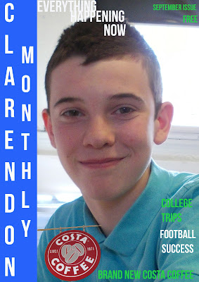
I think the overall look of both the cover and contents page look good .I think that the sizes of the font work well there not too big and overpowering but they are all easy to read and therefore not too small.The cover has followed the three colour rule (white blue and green).Due to having used the same font and colour scheme it is apparent that the cover page and contents page belong to the same magazine in my opinion.I think the 'Clarendon monthly ' shadowed looks good on the contents page.The photographs taken were all good and appropriate in my opinion , the brief stated that I needed to use a medium close up shot on the cover which I have done.I like the picture of the student that I used on the cover its a nice smile and he looks relaxed and happy to be at college.I think the pictures used on the contents page are a good variety there are some photographs of professionally made signs and some more fun ones like the students playing pool.Luckily in the process of making my college magazine i took more than enough pictures to be able to pick ones that were well taken and were not blurry for example.The amount of stories used on the front page is just right I think, In my opinion with more than three stories you would loose the students(target audience) attention too fast.There are plenty on the contents page and I think the volume of stories helps to bring the magazine to life so to speak .I think that my magazine would appeal to students looking for a way to catch up on the latest college news. If I had to pick anything to change on my magazine if I were to do it again it would be the colour scheme ,I do think it works together but I think it would appeal slightly more to the male market . Colours are definitely something i am going to consider very carefully when planning my music magazine.Also the contents page would look more professional if it were to have a Regular contents and Featured contents section.
Subscribe to:
Post Comments (Atom)


No comments:
Post a Comment